Inclusive Innovations website
Inclusive Innovations website
Project overview
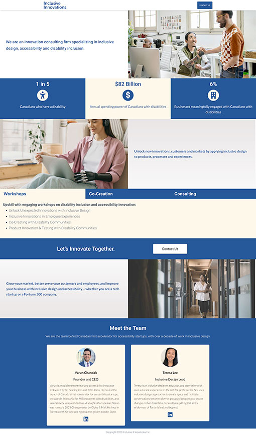
Design a “phase one” wordmark and responsive website for consulting firm, Inclusive Innovations, specializing in inclusive design, accessibility and disability inclusion to launch in time for an upcoming industry event.
My role
UX design, brand design, interaction design.
Responsibilities
Wireframing, web design, UX writing, digital accessibility testing, graphic design.
Project duration
1.5 months

Problem
Inclusive Innovations needed a “phase one” wordmark and a one-page responsive website to communicate the high-quality services and expertise in accessibility they offer. The website also needed the ability to create additional pages for a variety of content post-launch.
Goal
Design branding and a responsive, accessible website that makes it very easy for users to learn about the services offered by Inclusive Innovations.
Understanding the target audience
Site map
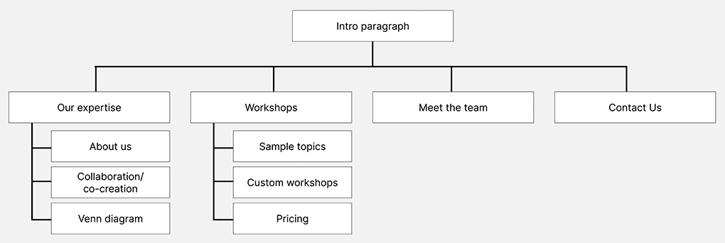
After a conversation about Inclusive Innovations’ needs and their target audience segments, I started work on setting the information architecture based on the brochures given to me as a guide.
A lot of information needed to be displayed due to the broad range of services offered, so I decided to split the content into sections in order to prevent users from being overwhelmed with a lot of text. This also makes it easy for users to scan.

Starting the design
Paper wireframes
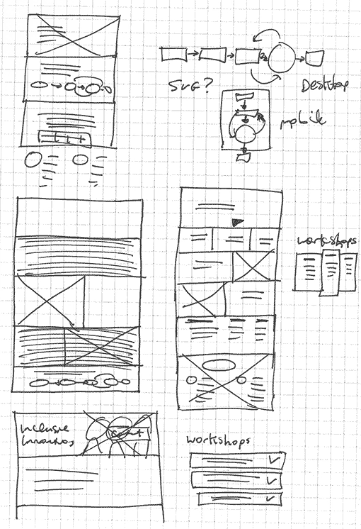
I sketched paper wireframes for the website homepage and subpage templates trying various layouts. I also ensured the site would be fully responsive across devices.
I used a storytelling approach for the UI so as people scroll down the page, the UI will communicate the services offered by Inclusive Innovation and how they can help their clients.

Refining the design
Digital wireframes
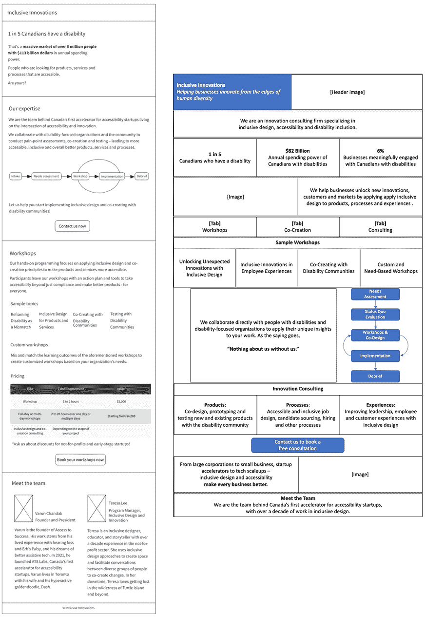
Moving from paper to digital wireframes, along with proposing copy, made it easy to understand how the design could tell the Inclusive Innovations story while being easy to scan and absorb information.
I presented two wireframes and worked with the client to further refine and section off content.


Branding
I chose a colour scheme and font pairings that communicated the top-notch expertise of Inclusive Innovations and passed digital accessibility compliance.
I sourced photos to communicate disability inclusion in a variety of office roles.
A Venn diagram initially proposed in the wireframes was replaced with a bulleted list as I found it was unfeasible to make it both mobile-responsive and accessible.

Accessibility considerations
1
2
3
4
Accessibility considerations
1
2
3
4
Takeaways
Impact
- Accessibility-compliant website that is responsive to mobile devices.
- Client can reference website when interacting with interested parties.
What I learned
- Some frameworks claim to be accessible yet prove otherwise. Back-end development saves the day once again!
- SVG images require a lot of testing across browsers and devices.
- Header tags may not be the optimal method for setting tabbing order in some situations.
