Tik Tak Tiki Bar mobile app
Student project, Google UX Design Certificate
Tik Tak Tiki Bar mobile app
Student project, Google UX Design Certificate
Project overview
The Tik Tak Tiki Bar mobile app will let users place food orders in advance, affecting busy users by letting them skip the in-store order line and save time. Effectiveness will be measured by tracking the number of orders completed in the app.
My role
End-to-end UX design. From concept to hi-fi prototype.
Responsibilities
User research, storyboarding, wireframing, prototyping, visual design, digital accessibility.
Project duration
2 months
Problem
Create a mobile for Tik Tak Tiki Bar, a beachfront snackbar, frequented by many customers with low vision and/or little knowledge of English who would like to be able to order food quickly and efficiently without needing to ask for assistance.
Goal
Enable users to use the mobile app to place food orders in advance so that they can skip the in-store order line and save time. Effectiveness will be measured by tracking the number of orders completed in the app.
Understanding the user
User research
I conducted interviews and created empathy maps to understand the users I’m designing for and their needs. A primary user group identified through research was working with adults with disabilities who prioritise a work/life balance.
This user group confirmed initial assumptions about Tik Tak Tiki Bar customers, but research also revealed that most apps aren’t accessible to assistive technology. Other user problems included feelings of discomfort with having to ask staff to read menu items for them when ordering in person.
Pain points
Time
Working adults are too busy and prioritise work/life balance.
Accessibility
Platforms for ordering food are not compatible with assistive technologies.
Information Architecture
Text in restaurant menu apps are often difficult to read and order from.
Pain points
Time
Working adults are too busy and prioritise work/life balance.
Accessibility
Platforms for ordering food are not compatible with assistive technologies.
Information Architecture
Text in restaurant menu apps are often difficult to read and order from.
Persona
Leah is a doctor with low vision who needs to use assistive technology to read food menus in mobile apps when on the go because her schedule is unpredictable.

User journey map
I created a user journey map to uncover emotions and pain points people represented by the aforementioned user persona will most likely experience during the food ordering process.
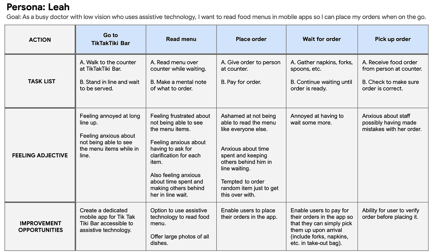
User journey map
I created a user journey map to uncover emotions and pain points people represented by the aforementioned user persona will most likely experience during the food ordering process.
Starting the design
Paper wireframes
I took the time to draft iterations of each of the app’s screens to ensure elements addressed user pain points. For the home screen, I prioritised a quick and easy process to help users save time.
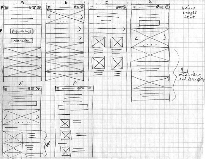
Stars marked elements of each sketch that would be used in the initial digital wireframes.
Paper wireframes
I took the time to draft iterations of each of the app’s screens to ensure elements addressed user pain points. For the home screen, I prioritised a quick and easy process to help users save time.
Stars marked elements of each sketch that would be used in the initial digital wireframes.
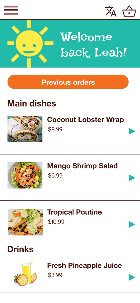
Digital wireframes
Designs were based on feedback and findings from the user research as I continued the initial design phase.
- Customized to user’s profile to make the overall user experience more personal.
- Laying out the menu in one screen makes it easier for the user to choose items without navigating different screens for each category.
- “Previous orders” button provides users a quick option to order favourites further speeding up the ordering process.
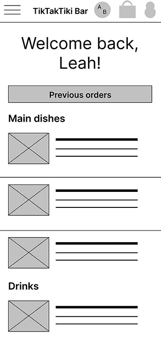
Being fully accessible to assistive technology was a key user need to enable users of all abilities to place their own food orders.
- Large photos for users with low vision.
- Users with little knowledge of English can choose which language to read the app
- Plain language description of food items.
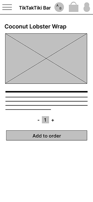
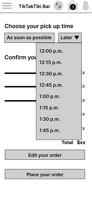
Low-fidelity prototype
The low-fidelity prototype connected the primary user flow of placing a food order and choosing a pick-up time for use in a usability study with users.
View the Tik Tak Tiki Bar low-fidelity prototype.
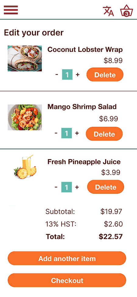
Refining the design
Mockups
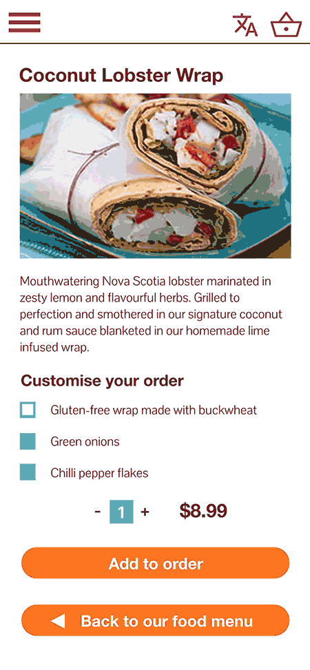
Users want customisation options in their food orders.
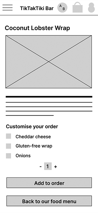
Mockups
Users want customisation options in their food orders.
High fidelity mockups
High fidelity mockups
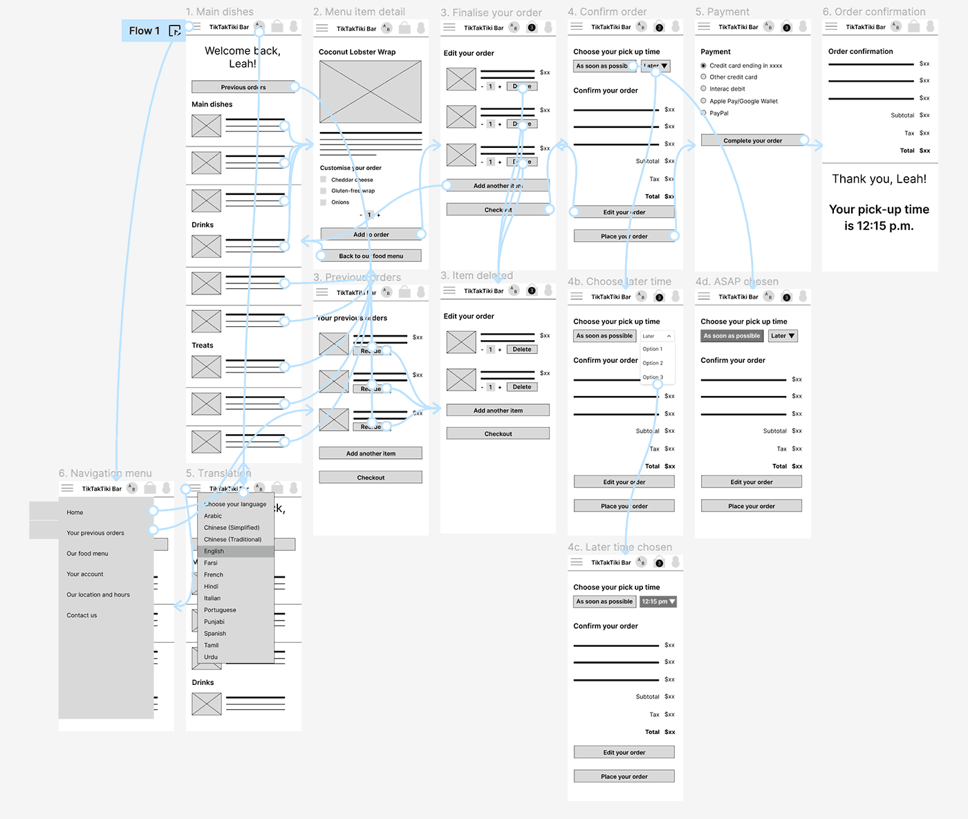
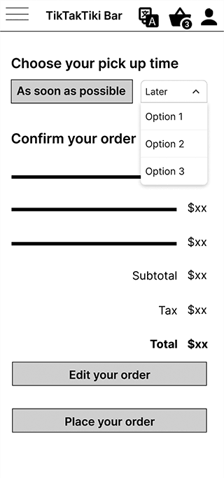
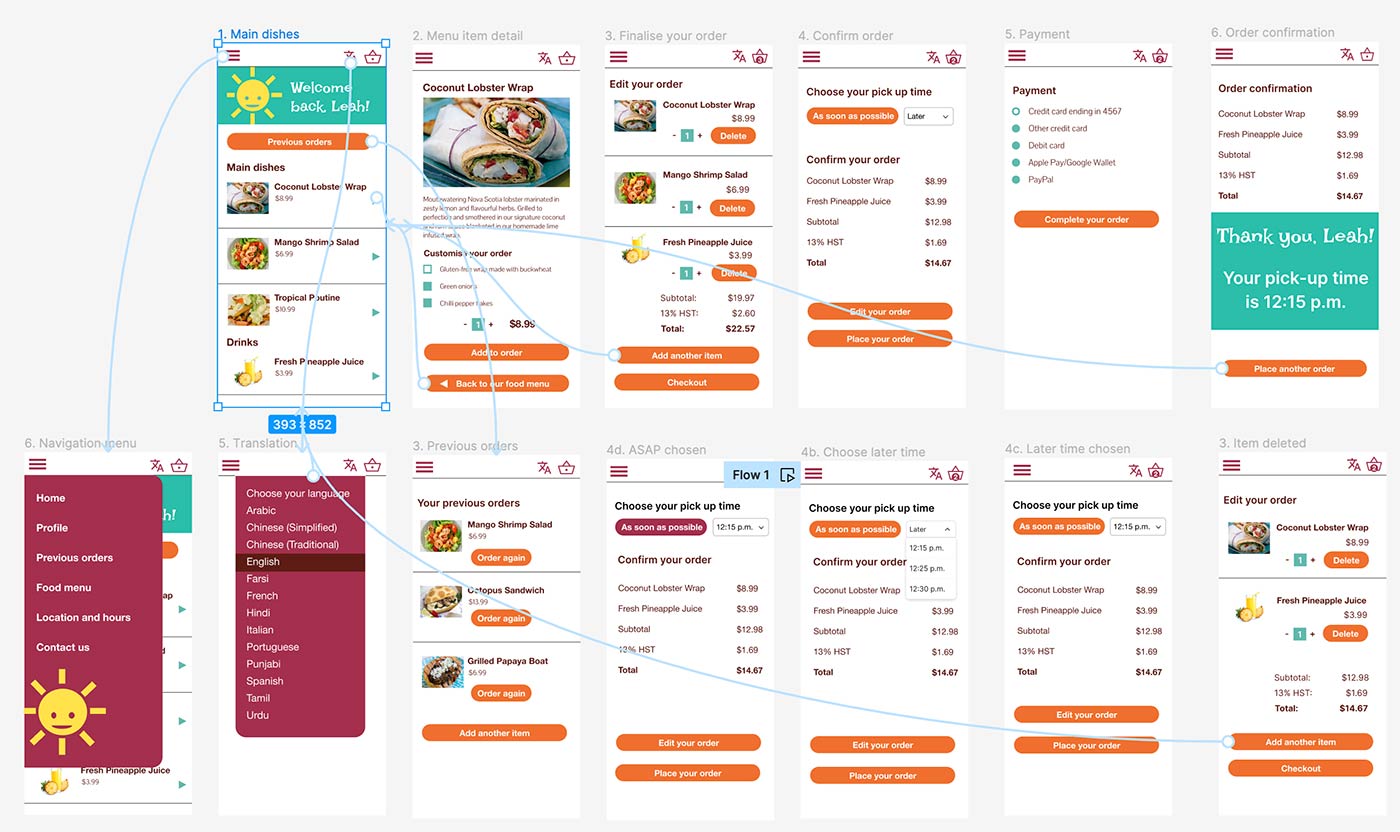
High-fidelity prototype
The final high-fidelity prototype presented cleaner user flows for choosing and selecting food orders. It also met user needs for customization options.
View the Tik Tak Tiki Bar high-fidelity prototype.
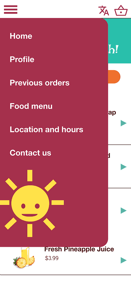
Accessibility considerations
1
2
Ensure animations and motions are subtle and accessible.
3
Translation feature ensures customers with little English can order food items with ease.
Accessibility considerations
1
2
Ensure animations and motions are subtle and accessible.
3
Translation feature ensures customers with little English can order food items with ease.
Takeaways
Takeaways
Impact
- “I love the colour scheme! It makes me think of the beach.”
- “The app flows nicely and it’s pretty logical. No complaints.”
- “Accessibility wise, it was easy for me to read.”
What I learned
- Conducting UX research for a food-ordering app can benefit better by running studies with more than 5 users.
- Users want customization options in their food orders.
- Users want to use assistive devices native to their devices.
Next steps
1
2
3
Next steps
1
2
3